玩转SVG动画
可缩放矢量图形(Scalable Vector Graphics,SVG),是一种用于描述基于二维的矢量图形的,基于 XML 的标记语言。本质上,SVG 相对于图像,就好比 HTML 相对于文本。
动画元素
动画元素放在形状元素的内部,用来定义一个元素的某个属性如何踩着时点改变。在指定持续时间里,属性从开始值变成结束值。
SVG动画元素有以下几个:<animate>,<animateColor>,<animateTransform>,<animateMotion>,<discard>,<mpath>,<set>
animate
animate是基础动画元素,实现单属性的动画过渡效果。

<svg width="200" height="200" xmlns="http://www.w3.org/2000/svg">
  <g>
    <text font-size="100" y="130" x="100">
    🐖
      <animate attributeName="x" from="150" to="50" begin="0s" dur="3s" repeatCount="indefinite" />
    </text>
  </g>
</svg>
也可以同时使用多个animate

<svg width="200" height="200" xmlns="http://www.w3.org/2000/svg">
  <g>
    <text font-size="100" y="130" x="100">
    🐖
      <animate attributeName="x" from="150" to="50" begin="0s" dur="3s" repeatCount="indefinite" />
      <animate attributeName="opacity" from="0" to="1" begin="0s" dur="3s" repeatCount="indefinite" />
    </text>
  </g>
</svg>
animateTransform
一看这属性就知道实现transform变换动画效果的~

<svg width="200" height="200" xmlns="http://www.w3.org/2000/svg">
  <g>
    <text font-size="50" y="80" x="80">🐷</text>
    <animateTransform attributeName="transform" begin="0s" dur="3s"  type="scale" from="1" to="1.5" repeatCount="indefinite"/>
  </g>
</svg>
animateMotion
animateMotion元素可以让SVG各种图形沿着特定的path路径运动~
那就来感受一下会爬山的猪~

<svg width="360" height="200" xmlns="http://www.w3.org/2000/svg">
  <text font-size="40" x="0" y="0" fill="#cd0000">猪
    <animateMotion path="M10,80 q100,120 120,20 q140,-50 160,0" rotate="auto" begin="0s" dur="3s" repeatCount="indefinite"/>
  </text>
  <path d="M10,80 q100,120 120,20 q140,-50 160,0" stroke="#cd0000" stroke-width="2" fill="none" />
</svg>
动画的暂停与播放
SVG其实内置了动画的暂停和播放的API:
// 暂停
svg.pauseAnimations();

// 播放
svg.unpauseAnimations();
最强大的元素 ---- path
path是一个可以构建出你所能想象的几乎任何高级的2D图形的基本形状~
那么如何做path动画呢?
这里我们用到SVG的两个属性:stroke-dasharray 和 stroke-dashoffset。
stroke-dasharray 属性可以控制图案描边路径的样式,如果你并不想用连续的直线去绘制路径,而希望通过一些不同样式的虚线,你就可以使用这个属性。
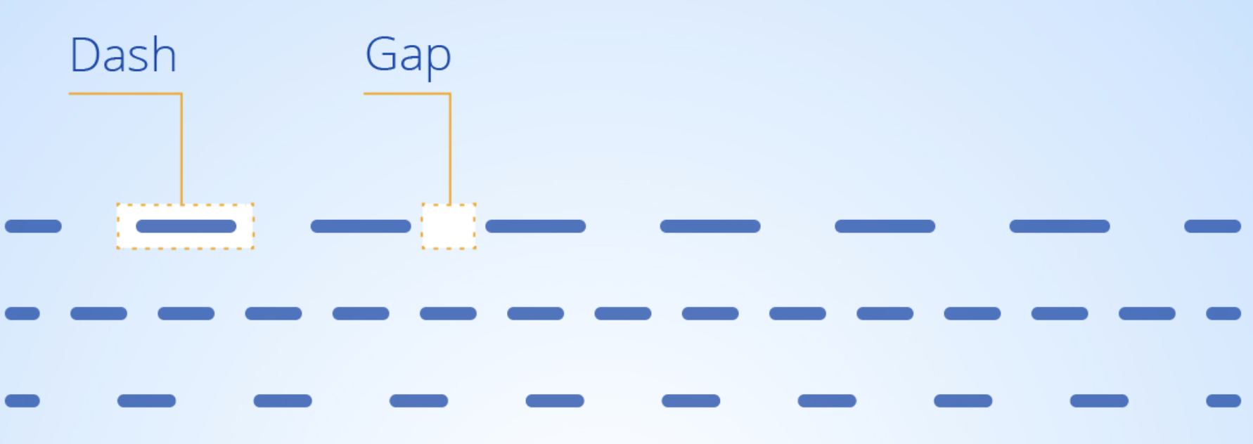
stroke-dashoffset 属性设置虚线在原路径下的偏移量。
path动画原理
为了平稳流畅地绘制出这个路径,首先我们需要通过 stroke-dasharray 属性设置虚线段的长度,将 stroke-dasharray 属性的值设为该路径的长度。这样的话就将虚线的每一段 dash 和 gap 的长度等于整段路径的长。
下一步我们需要使用 stroke-dashoffset 属性将虚线的偏移量设置为 0,此时我们看到的路径描边就是没有间断的连续曲线(实际上看到的是虚线段的第一段,前面已经设置每一虚线段的长度等于该曲线的长)。通过设置虚线偏移量等于曲线的长度,那该曲线恰好“消失”(实际上看到的是虚线段的一段间隙)。
通过 stroke-dashoffset 属性,同时结合 CSS3 的 animation,你可以让该曲线一点点的出现在屏幕上,这就是 SVG 路径动画的原理。
<svg width="300" height="175" xmlns="http://www.w3.org/2000/svg">
  <path class="path" fill="transparent" stroke="#000000" stroke-width="4" d="M10 80 Q 77.5 10, 145 80 T 280 80"></path>
</svg>
svg {
  display: block;
  width: 300px;
  .path {
    stroke-dasharray: 320;
    stroke-dashoffset: 0;
    animation: dash 1s linear;
  }
  @keyframes dash {
    from {
      stroke-dashoffset: 320;
    }
    to {
      stroke-dashoffset: 0;
    }
  }
}
如何配合Javascript擦出更大的火花
Step 1: 先来个path
<svg xmlns="http://www.w3.org/2000/svg" viewBox="0 0 100.6 107.6" id="star-svg">
  <path id="star-path" fill="none" stroke="black" stroke-width="2"  d="..." />
</svg>
Step 2: 获取path的长度
var path = document.querySelector('.path');
var pathLength = path.getTotalLength();
Step 3: 结合 stroke-asharray 和 stroke-dashoffset 把形状隐藏起来
path.style.strokeDasharray = pathLength + ' ' + pathLength;
path.style.strokeDashoffset = pathLength;
Step 4: 当页面滚动, 把偏移量百分比设置为滚动的百分比
// 当页面滚动起来~
window.addEventListener("scroll", function(e) {

  // 滑动的百分比是多少?
  var scrollPercentage = (document.documentElement.scrollTop + document.body.scrollTop) / (document.documentElement.scrollHeight - document.documentElement.clientHeight);

  // 虚线偏移量
  var drawLength = pathLength * scrollPercentage;

  // 设置偏移量
  path.style.strokeDashoffset = pathLength - drawLength;

});
这次的分享就到此结束啦,希望对大家有所帮助~ 谢谢!